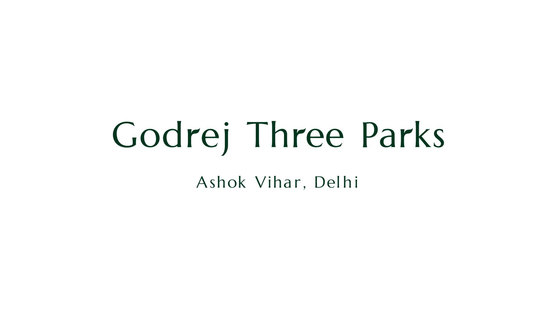
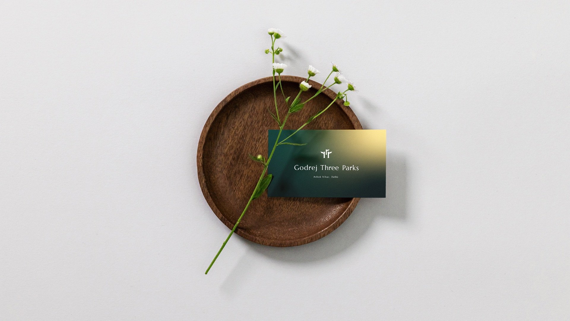
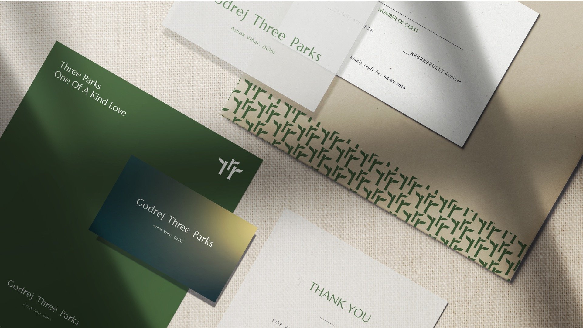
Godrej Three Parks
Design strategy, Brand architecture, Logo design, Merchandise, Brand guidelines
Client
Godrej Properties
Year
2023
Creative Director
Eureka Alphanso
Senior Designer
Piyush Bhagat
Visual Designer
Nayanika Johari
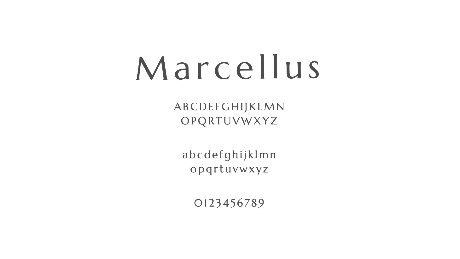
Typeface
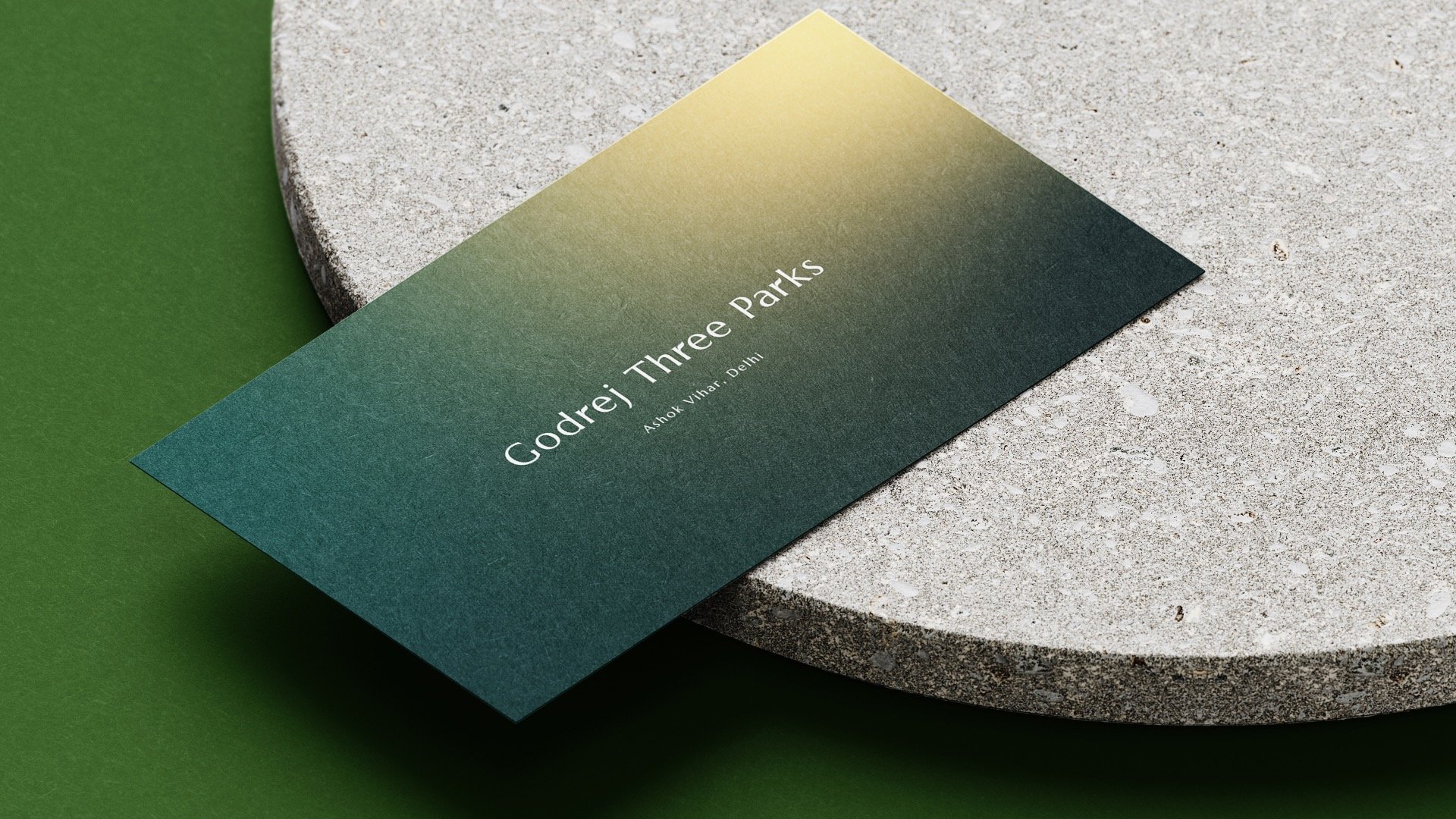
Marcellus and Marcellus SC (small caps) are a set of flared serif typeface families, inspired by classic Roman inscription letterforms.
While the SC family leans more towards the titling style of Trajan, the Regular version lends itself to a wider range of usage.
These elegant typefaces, when combined in use, exude clarity and beauty for both on screen and printed materials.

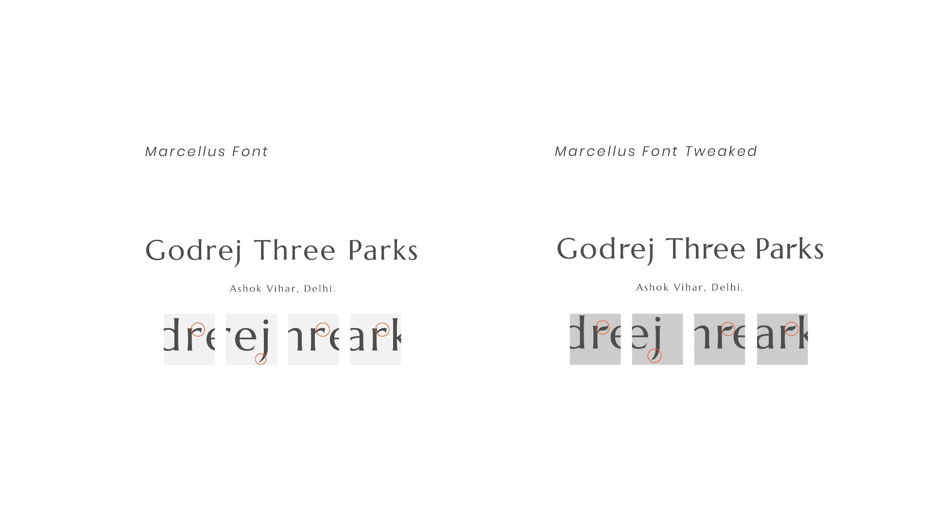
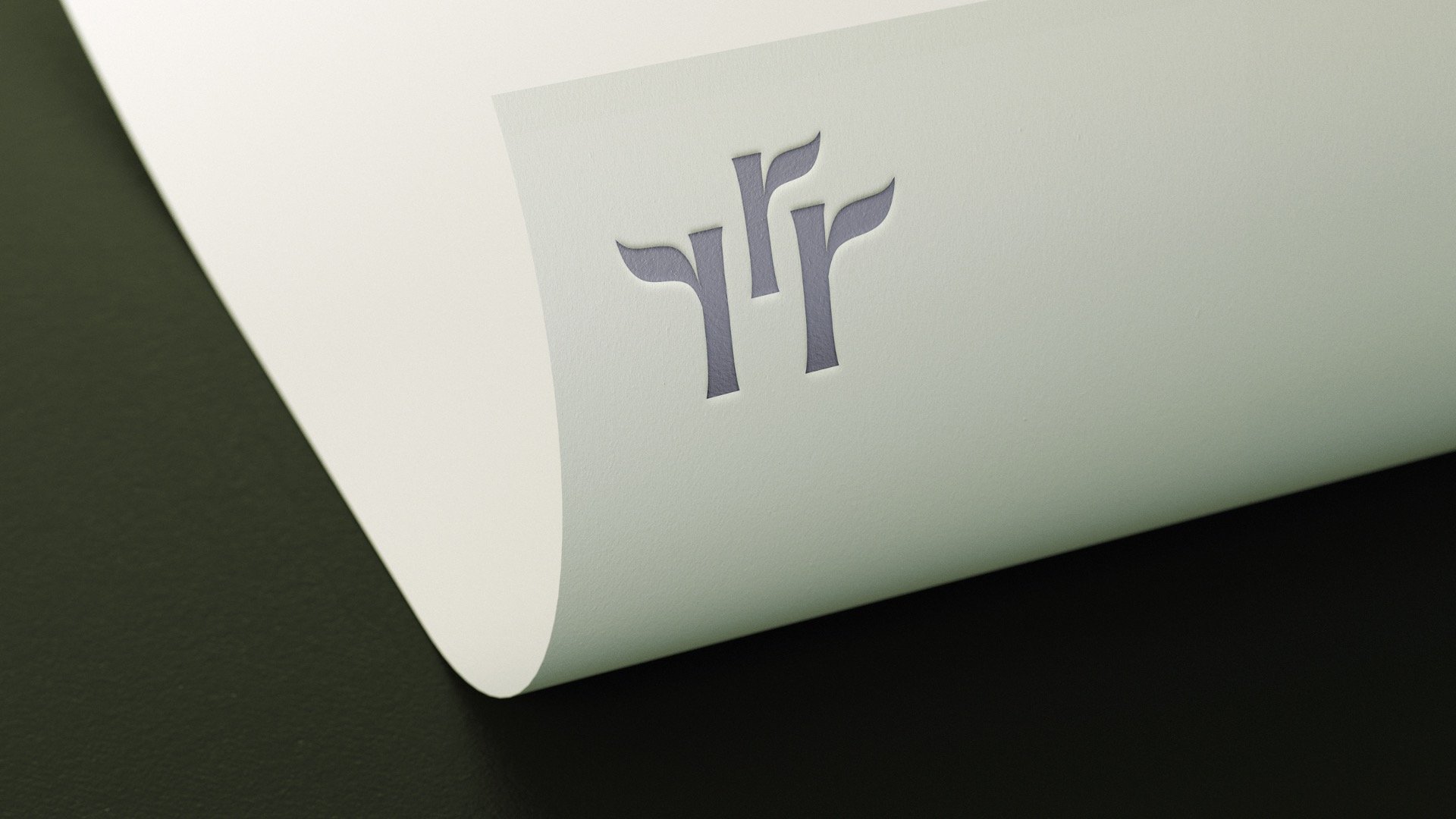
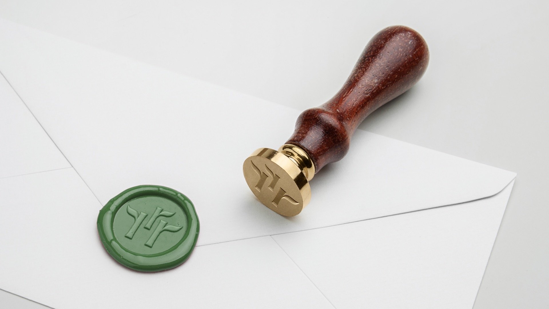
The three parks play an important role in the identity of the property.
A swaying leaf is used as a symbol for each park. The logo highlights these three parks by tweaking the three R’s in the shape of a leaf and acts as constant reminders to the offering of the property.
Customer Takeaways

Godrej Three Parks
To capture the essence of the three parks, I wanted to subtly highlight a hidden mnemonic within the word mark. When one reads the full brand, they are reminded that the beauty and individuality of trees are at the heart of this property.